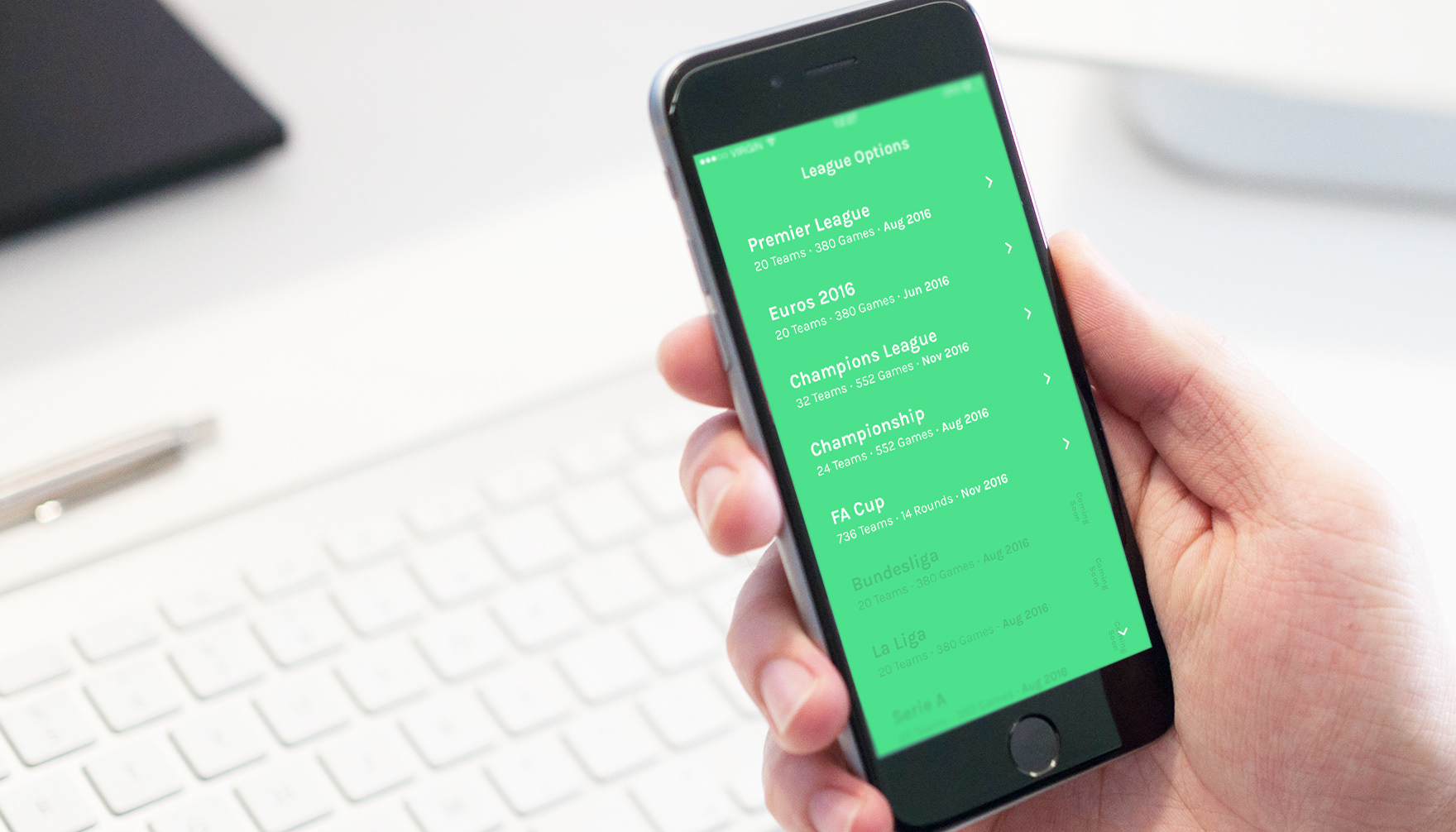
Scored App
This concept started in 2016 as a response to a simple frustration. As a regular football fan, I found most score apps cluttered with adverts, unnecessary content, and visual noise, often making it harder to quickly find the one thing you actually need, the score.
The aim of this project was to strip the experience back to its essentials and rethink how match information could be presented more clearly. Rather than adding features, the focus was on reducing friction and prioritising the most important information.
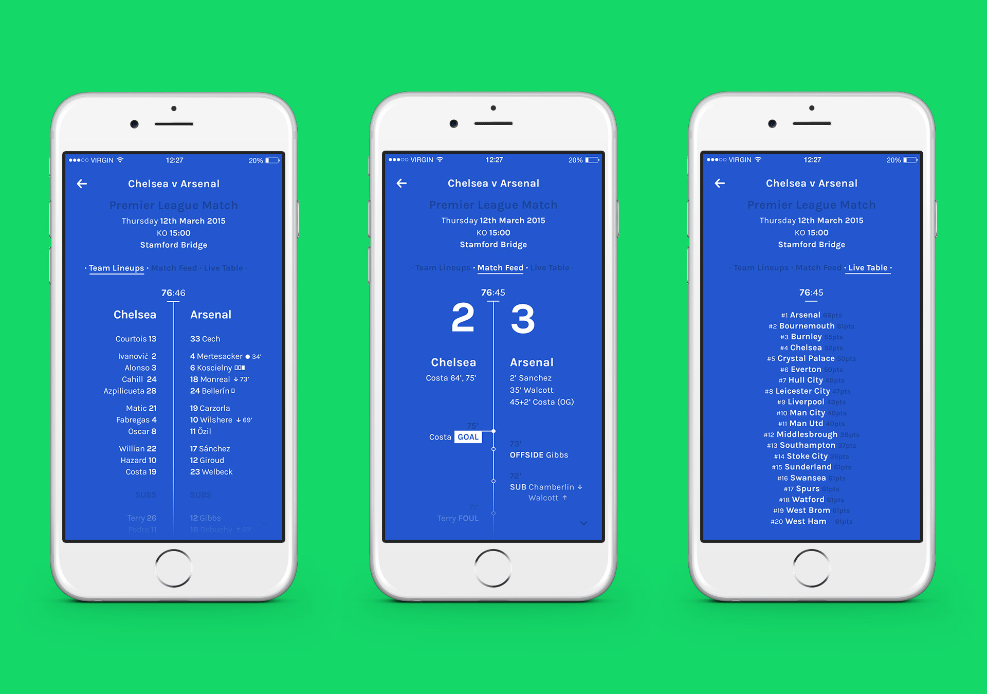
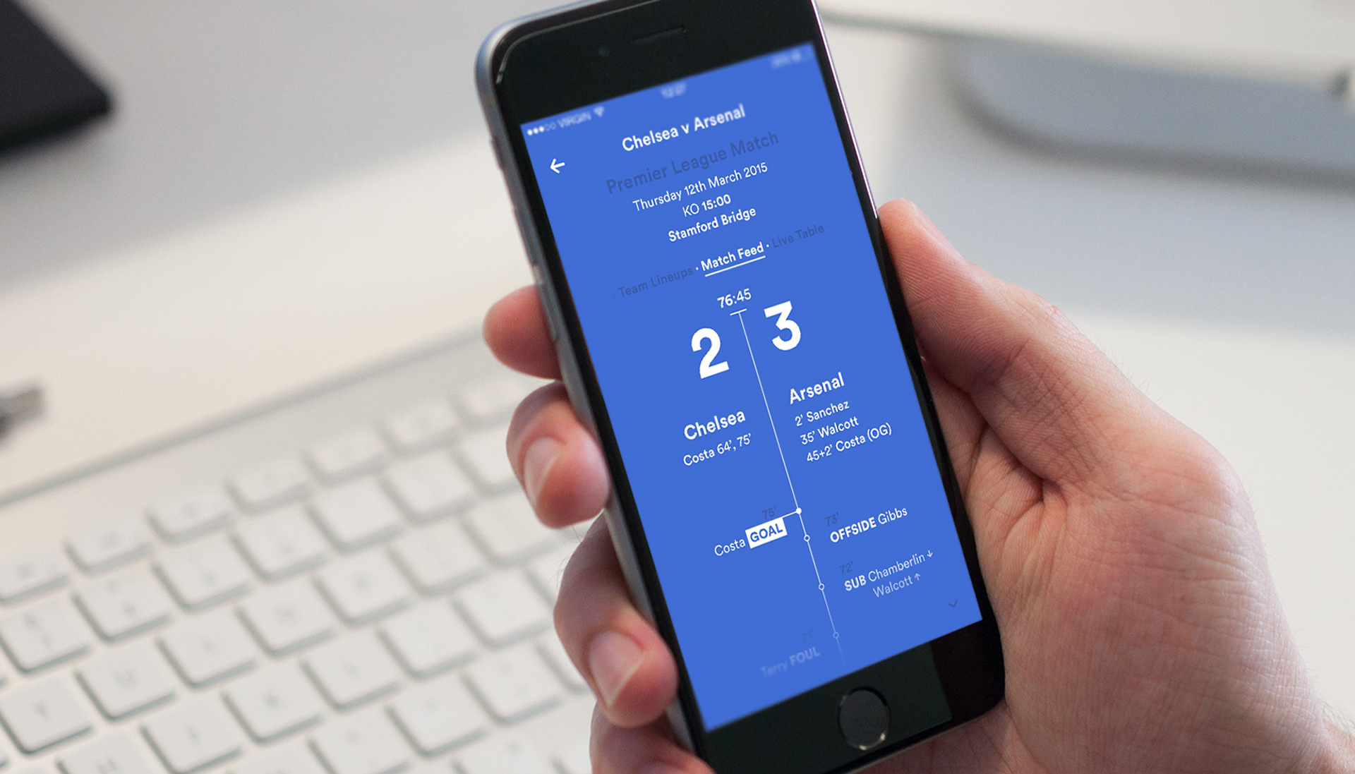
The interface was designed to centre around a small set of key elements: score, line ups, live match updates, and league position. Everything else was removed. A typographic approach was used to create a clear visual hierarchy, making it easy to scan and understand the state of a game at a glance.
Colour was used functionally, adapting to the teams involved in each match. This created a subtle sense of context without adding complexity, helping users quickly orient themselves within different fixtures.
While the project began as a visual and typographic exploration, it became an exercise in simplifying a common product experience. Focusing on clarity, speed, and relevance rather than feature depth.